ATP Design Works

ATP Design Works
Showing posts with label Voices Of Glory. Show all posts

Tuesday, November 22, 2011

VOG Concert 2011 Tri Fold Program

This was definitely a fun project. As I do every year I get the privilege of designing the program for our annual gospel concert. This year since I was very pressed for time I had to really unleash the creativity and work fast!
VOG Concert 2011 Tri Fold Program (Inside)
As God gave me the vision for the flier and gave us the direction for the theme, a big part of putting this all together was already in place. Again, with the divine inspiration, I decided to go with the same tri fold brochure style program. In this instance, it world simulate the various maps, travel guides, and vehicle maintenance pamphlets, which ties into our main theme "I Won't Turn Back!" We're on the road with God. We have said we won't turn back. The bible is our roadmap to life. Etc. AND It also works with the key scripture in John 6:63-69. Pretty cool, huh!

So with all these in place, I merely needed to drop the info in where it needed to go. This time around I decided on doing the design and layout all in Photoshop versus InDesign. I opened the picture I took in Australia. (see the blog on that for the story), and began to play with type placement, and color. Still, there were a couple of panels that had to be addressed. For these, I remembered that while I was searching for a cool type effect to use as a possible main element for the flier, I came across another effect that I saw had potential as a good support element for this occasion. As it turns out, Abduzeedo again, provided the tutorial for the typography wallpaper technique I used here. To see how, follow this link: Typography Wallpaper
VOG Choir 2011

The last element and inspiration hit just before "zero hour", and right after I had most of the program in place. We needed a current picture to add the final touch to the work. I sent a quick text to the choir members stating that we would be taking a picture right after our final rehearsal, and I grabbed my camera gear and headed off to rehearsal. Some members couldn't make the final, and some could stay around, but with the help of my dear friend and fellow photographer John Bulwer, we rounded the choir up, played with lighting, moved furniture, placed everyone we had and took one cool picture.

The Ladies of VOG
About eight hours behind my personal schedule, ( I had a TON of other things to do for the concert AND my side hustle!) I was done with the program and ready to enjoy a bit of the rest of my day. Yogurtland with The SYDe, and my volleyball game later that evening.
At the concert, I kept getting compliments on the design and it made for a great keepsake of the powerful night we had as we sang to our 'Audience of One".
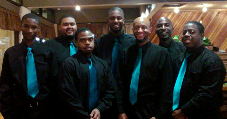
The "Classic" Fellas Shot!

Thursday, November 10, 2011

VOG Concert 2011 Flier

The OFFICIAL flier for the Voices Of Glory 2011 Gospel concert "I Won't Turn Back" utilizing original photography, and type placement and manipulation in Photoshop.

The photo was from one of the back roads we were on somewhere north of Deception Bay when the Island Breeze guys and I went pig hunting in Australia. I had stay with the YWAM (Youth With A Mission) group during my first week or so of my mission trip, and this second time was an unplanned stay for me which I thoroughly enjoyed! On the morning I was to leave, I was informed that the guys were going to hunt pigs so they could prepare a feast for the graduates of the program, so how could I NOT go? We headed out and after a couple of stops, a redirection, and a few wrong turns, we ended up at a huge farm off of an isolated road. I stepped out on to they highway and was in awe of the scenery that stretched before me. When I lined the shot up I knew I was going to have use for it some way, and in some capacity. I just had no idea it was going to be like this! Wow! Several people have even commented that this is a professional grade photo. (Technically it is, but I understood what they meant. *wink*) I mean I'm not against a company like Getty Images buying this from me or anything. *Hint Hint*

The title type treatment is a distort effect used to simulate the road paint on the highways. I used several effects and used red to add emphasis to the overall message. All in all this is definitely an image dominated flier with type as a support element.

Tuesday, November 9, 2010

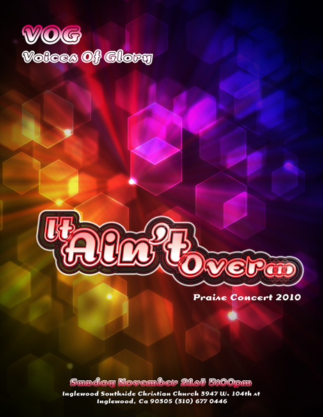
VOG Flier Project

Each year our "young adult" choir has a concert and invites all of our family and friends to come out and praise God with us on one special night. Being blessed with artistic abilities, I volunteer my services for the choir and do the promotions for the concert each year. This year, with coordinating the volleyball ball team, The SYDe, folks traveling, and a myriad of other activities, all of our concert preparation was pushed back...Way back. I can't believe our concert is in two weeks! Normally I like to get visuals out to people a month in advance, and just give reminders as the date approaches. To give you an indication of what kind of time frame I'm working with, we just came up with our theme last week. The most important part of the concert is the music, of course, and for that portion, we will be ready to go, but presentation is also a big part, and a good visual can go a long way to enhance the whole experience. Besides, who doesn't enjoy a cool visual?

This year's theme is "It Ain't Over". Based on one of the songs we will be presenting, it speaks of hope and perseverance through adverse times and circumstances if we have faith in the Lord. Not having a long amount of time to do a complex illustration, or long photo shoot, I decided to go simple and focus more on typography, and something more abstract. I took some time to sketch out a concept, with type, then looked for a type face to approximate what I sketched out. The closet thing to what I envisioned was the typeface "Dogma", so I set to work in Illustrator to see just how I could manipulate this type. I first played with the size, merged and overlapped some paths, and added a gradient. Then with the the new look, I reversed some of the outlines added a couple of off set paths, then overlapped 3 variations at different opacities.

With the main type together, I went to look for a cool background that I could create that would fit well with what I had envisioned. Thanks to networking on Twitter, I had connected with an awesome designer in San Francisco who posts various tutorials on how to make some cool backgrounds and effects. For this one I used Fabian Sasso's (aka Abduzeedo) Hexagonal Bokeh Background tutorial to give the flier it's overall look, and graphic punch. (Thank you again for sharing Fabian!)

I want you to consider this your official invite to the VOG 2010 Concert. We know you will enjoy the praise, and I hope you enjoy the graphics...I still have to design the actual program, so I'll get to cranking on that so you can have a piece of my work to take home with you. More information is on the flier, or you can visit our Facebook Event Page, or the Inglewood Southside Christian Church Page for the address and contact numbers. Hope you can join us!