ATP Design Works

ATP Design Works
Showing posts with label Graphic Design. Show all posts

Monday, February 2, 2026

The "You're Invited!" Project

This is the latest of graphic design projects given to me at Inglewood Southside Christian Church. The concept was to create a communication card  type of invitation to be handed out to others inviting them to services. 

I was given free creative license and just sent design work back for approvals before the were sent to print. All dimensions were given to me. 


Thursday, November 10, 2011

VOG Concert 2011 Flier

The OFFICIAL flier for the Voices Of Glory 2011 Gospel concert "I Won't Turn Back" utilizing original photography, and type placement and manipulation in Photoshop.

The photo was from one of the back roads we were on somewhere north of Deception Bay when the Island Breeze guys and I went pig hunting in Australia. I had stay with the YWAM (Youth With A Mission) group during my first week or so of my mission trip, and this second time was an unplanned stay for me which I thoroughly enjoyed! On the morning I was to leave, I was informed that the guys were going to hunt pigs so they could prepare a feast for the graduates of the program, so how could I NOT go? We headed out and after a couple of stops, a redirection, and a few wrong turns, we ended up at a huge farm off of an isolated road. I stepped out on to they highway and was in awe of the scenery that stretched before me. When I lined the shot up I knew I was going to have use for it some way, and in some capacity. I just had no idea it was going to be like this! Wow! Several people have even commented that this is a professional grade photo. (Technically it is, but I understood what they meant. *wink*) I mean I'm not against a company like Getty Images buying this from me or anything. *Hint Hint*

The title type treatment is a distort effect used to simulate the road paint on the highways. I used several effects and used red to add emphasis to the overall message. All in all this is definitely an image dominated flier with type as a support element.

Tuesday, November 9, 2010

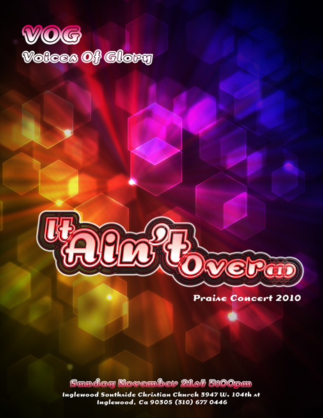
VOG Flier Project

Each year our "young adult" choir has a concert and invites all of our family and friends to come out and praise God with us on one special night. Being blessed with artistic abilities, I volunteer my services for the choir and do the promotions for the concert each year. This year, with coordinating the volleyball ball team, The SYDe, folks traveling, and a myriad of other activities, all of our concert preparation was pushed back...Way back. I can't believe our concert is in two weeks! Normally I like to get visuals out to people a month in advance, and just give reminders as the date approaches. To give you an indication of what kind of time frame I'm working with, we just came up with our theme last week. The most important part of the concert is the music, of course, and for that portion, we will be ready to go, but presentation is also a big part, and a good visual can go a long way to enhance the whole experience. Besides, who doesn't enjoy a cool visual?

This year's theme is "It Ain't Over". Based on one of the songs we will be presenting, it speaks of hope and perseverance through adverse times and circumstances if we have faith in the Lord. Not having a long amount of time to do a complex illustration, or long photo shoot, I decided to go simple and focus more on typography, and something more abstract. I took some time to sketch out a concept, with type, then looked for a type face to approximate what I sketched out. The closet thing to what I envisioned was the typeface "Dogma", so I set to work in Illustrator to see just how I could manipulate this type. I first played with the size, merged and overlapped some paths, and added a gradient. Then with the the new look, I reversed some of the outlines added a couple of off set paths, then overlapped 3 variations at different opacities.

With the main type together, I went to look for a cool background that I could create that would fit well with what I had envisioned. Thanks to networking on Twitter, I had connected with an awesome designer in San Francisco who posts various tutorials on how to make some cool backgrounds and effects. For this one I used Fabian Sasso's (aka Abduzeedo) Hexagonal Bokeh Background tutorial to give the flier it's overall look, and graphic punch. (Thank you again for sharing Fabian!)

I want you to consider this your official invite to the VOG 2010 Concert. We know you will enjoy the praise, and I hope you enjoy the graphics...I still have to design the actual program, so I'll get to cranking on that so you can have a piece of my work to take home with you. More information is on the flier, or you can visit our Facebook Event Page, or the Inglewood Southside Christian Church Page for the address and contact numbers. Hope you can join us!

Wednesday, September 1, 2010

Illustrating Joey

Many of you have been waiting to see the latest of my illustrations. This particular one I had to hold off on posting because it was going to be a surprise gift for my dear friend and "sister" Joey, and I didn't want her to see it until she had it in her hands.

Photo Credits: Roger Hung
This particular work was inspired by a photograph that her husband took of her during one of his photo shoots. To me it captured her essence very well. Her playfulness, her "agressive" side, her strength, and her beauty were all depicted in this photo. Immediately my mind flashed potential images of how I could recreate this image in my illustrative styles. Of all the visions I saw, I decided to go with a space scene. Maybe because I used to want to be an astronaut, maybe because the mysteries of space have always intrigued me, or just maybe because that trike could so easily be converted to a rocket, and I have always loved rockets!


I took some creative liberties in the positioning and costume on this one. I transformed her high neck sweater into a armor style breast piece with armored shoulder pieces. I kept the skirt as I felt it made a nice, flowing (and sexy) contrast to the smooth exactness of the torso piece. This was actually my second sketch of this particular piece, that I decided to work up. I will probably do another sketch (or two) of this photo, in slightly different set up and costume. Once I got the composition together, I inked it, and scanned it, then set about to add color to it.


*addendum* So I had been working feverishly on several other projects when I received confirmation that the drawing had reached it's destination, and was in the hands of its intended recipient, so in my haste to post this I misplaced the original sketch. I love showing a progression on these types of things, so I was a bit baffled that I couldn't find it. I even began to second guess my modus operandi when it didn't surface, so I just posted this blog and kept moving. I was going through some drawings weeks later, and there it was in all of its sketchy glory. I love the rough, unfinished quality of this stage of the work, and have often contemplated doing a few "unfinished-finished" pieces. Color fills yet with the flowing guidelines of a rough sketch. At any rate, I found this missing gem scanned it and did some quick levels and size adjustments in Photoshop, not too much, just enough to keep the fluid pencil look, while at the same time removing some of the darker "smudge" areas, and here it is to complete this blog. *


Rocket Scooter Joey
I guess the coloring portion is the real story to this. I did contemplate just scanning it in the computer and then playing with the colors in Illustrator as I had been recently doing with other pieces, but I wanted to do something with a more "hands on" approach. I had not done any hand coloring using my Prismacolor color pencils in a few years, so to be a little rusty with them would be expected. I began timidly. Not wanting to really screw this up, and got bolder as I progressed. I could hear my illustration professor in my head as I worked. "Mr Ron can really draw...*shakes head*...but he can not color!" We all had a good laugh in class that day, but that motivation propelled me to tighten up my coloring skills! Understanding how light affects different surfaces is key to improving with this media. As I continued to work, the colors seemed to blend just right and really enhanced the drawing, giving it another dimension. I definitely can improve on my techniques, but for such a long hiatus from the color pencil, this wasn't a bad "return to action".