This was definitely a fun project. As I do every year I get the privilege of designing the program for our annual gospel concert. This year since I was very pressed for time I had to really unleash the creativity and work fast!
 |
| VOG Concert 2011 Tri Fold Program (Inside) |
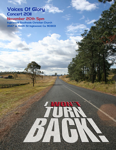
As God gave me the vision for the flier and gave us the direction for the theme, a big part of putting this all together was already in place. Again, with the divine inspiration, I decided to go with the same tri fold brochure style program. In this instance, it world simulate the various maps, travel guides, and vehicle maintenance pamphlets, which ties into our main theme "I Won't Turn Back!" We're on the road with God. We have said we won't turn back. The bible is our roadmap to life. Etc. AND It also works with the key scripture in John 6:63-69. Pretty cool, huh!
So with all these in place, I merely needed to drop the info in where it needed to go. This time around I decided on doing the design and layout all in Photoshop versus InDesign. I opened the picture I took in Australia. (see the
blog on that for the story), and began to play with type placement, and color. Still, there were a couple of panels that had to be addressed. For these, I remembered that while I was searching for a cool type effect to use as a possible main element for the flier, I came across another effect that I saw had potential as a good support element for this occasion. As it turns out, Abduzeedo again, provided the tutorial for the typography wallpaper technique I used here. To see how, follow this link:
Typography Wallpaper
 |
| VOG Choir 2011 |
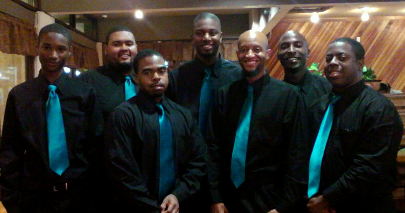
The last element and inspiration hit just before "zero hour", and right after I had most of the program in place. We needed a current picture to add the final touch to the work. I sent a quick text to the choir members stating that we would be taking a picture right after our final rehearsal, and I grabbed my camera gear and headed off to rehearsal. Some members couldn't make the final, and some could stay around, but with the help of my dear friend and fellow photographer John Bulwer, we rounded the choir up, played with lighting, moved furniture, placed everyone we had and took one cool picture.
 |
| The Ladies of VOG |
About eight hours behind my personal schedule, ( I had a TON of other things to do for the concert AND my side hustle!) I was done with the program and ready to enjoy a bit of the rest of my day. Yogurtland with The SYDe, and my volleyball game later that evening.
At the concert, I kept getting compliments on the design and it made for a great keepsake of the powerful night we had as we sang to our 'Audience of One".
 |
| The "Classic" Fellas Shot! |